My Eco
Pharmacy
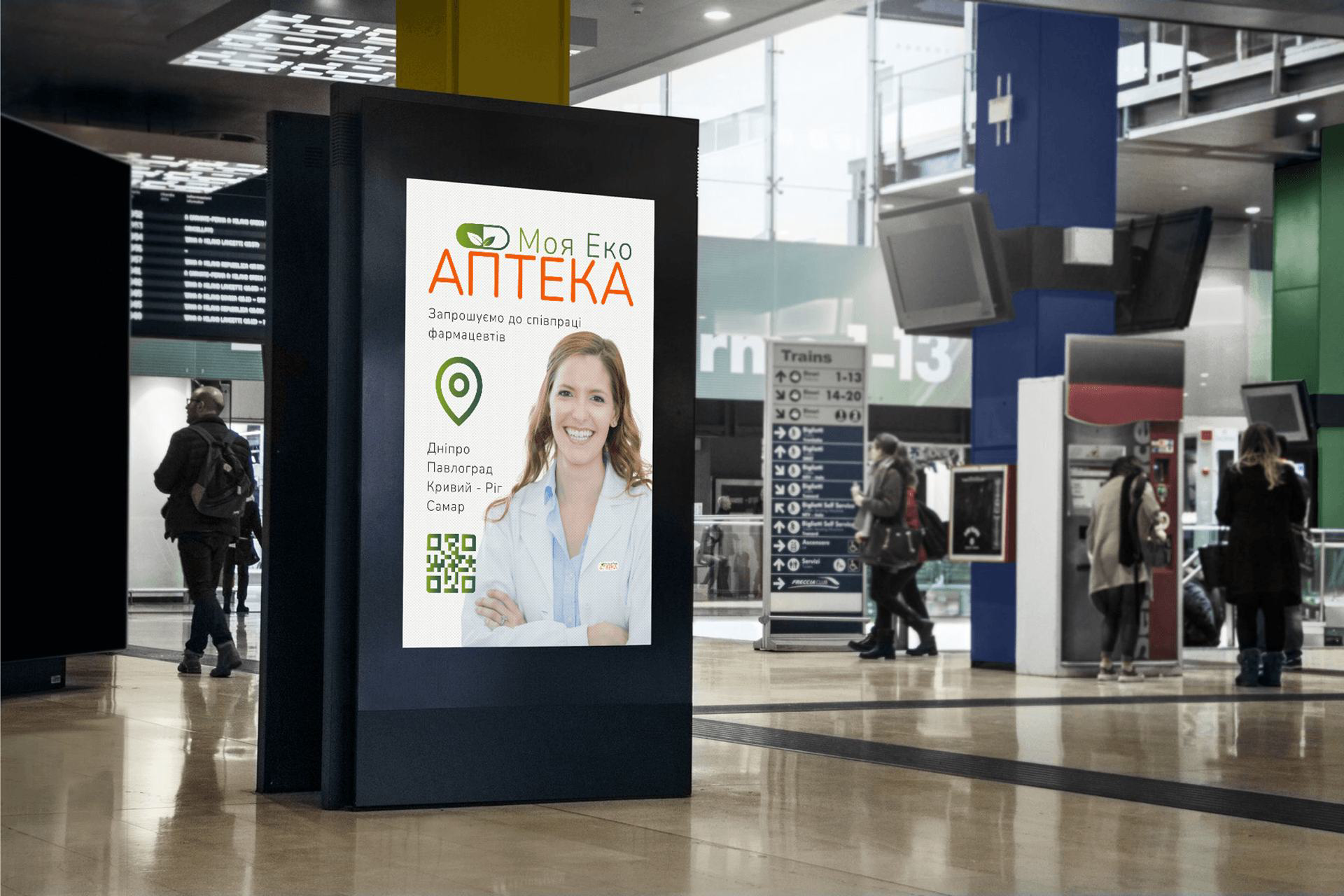
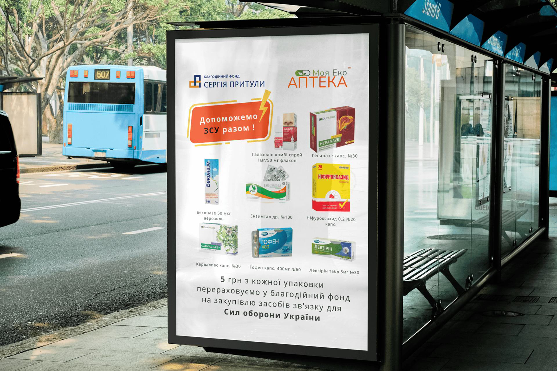
A sustainability-led identity and brand marketing for a Ukrainian pharmacy chain — “Моя Еко Аптека”. One warm, eco-minded mark — and the campaigns that carried it — built to hold from a shop sign to a charity citylight.
A pharmacy built on sustainable development.
The brief was an identity for a Ukrainian pharmacy that builds the principles of sustainable development into how it actually operates — not as a slogan, but as a structure. The whole image had to combine natural elements, a modern minimalist style and a clear association with eco-consciousness and care for health. It rests on three pillars.
Responsibility in running the business and fair treatment of partners and clients.
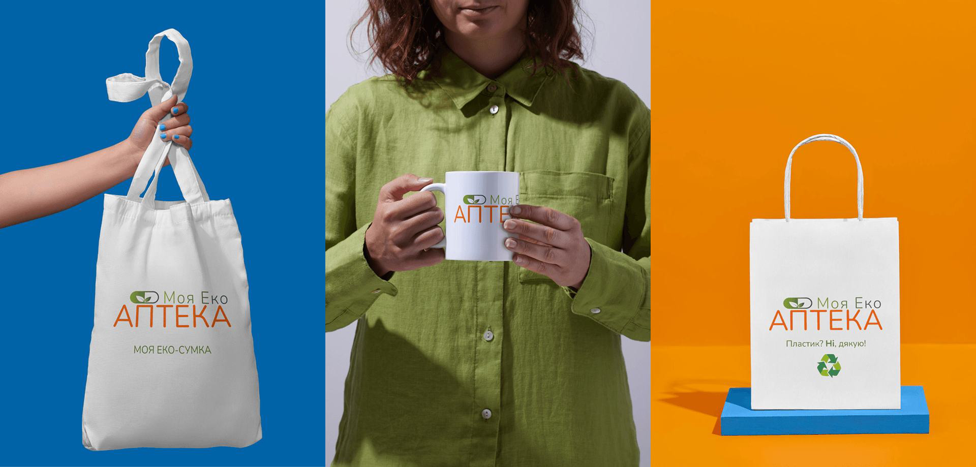
Ecological awareness, a smaller footprint and support for a healthy way of living.
Tolerance, care for people and strengthening the health of the community.
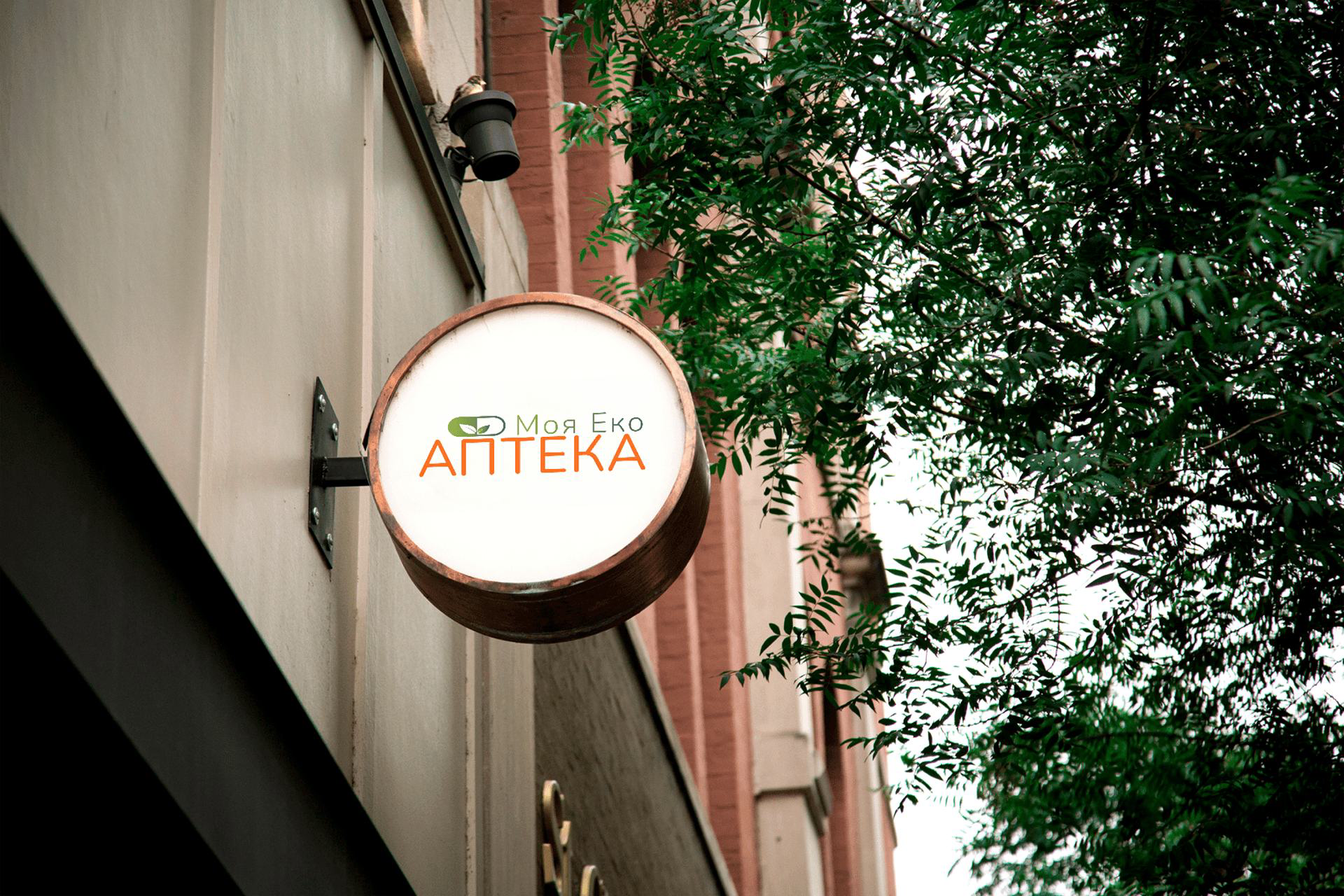
“Моя Еко Аптека” — a capsule that grows leaves.
The mark fuses the two halves of the idea: a pharmaceutical capsule for medicine and trust, with stylised plant leaves inside it for nature and the organic. Together they say “a pharmacy that cares — for you and for the world.”
“My” — personal involvement. Every client, pharmacist or partner can say: this is my pharmacy.
“Eco” — sustainability in practice: smart use of resources, fair prices and accessible medicine.
“Pharmacy” — not just a place to buy medicine, but a symbol of trust, reliability and professionalism.
Living green, energetic orange, clean white.
↳ CLICK A SWATCH TO COPY ITS HEX
Nunito — rounded, friendly, reliable.
NOPQRSTUVWXYZ
0123456789 — АБВГ
Nunito carries the identity: soft, rounded forms read as friendliness, trust and openness — exactly the welcome an eco pharmacy wants. It stays clear at small sizes across screen and print, and its balance of strict geometry and softness mirrors the brand itself: ecological, yet dependable.
Room to breathe, a floor it can’t cross.
Clear space keeps the logo legible and stops it merging with other elements: keep at least the height of the letter “А” from the wordmark free on every side. Below the minimum size the wordmark and the leaves lose clarity — so it has a hard floor.
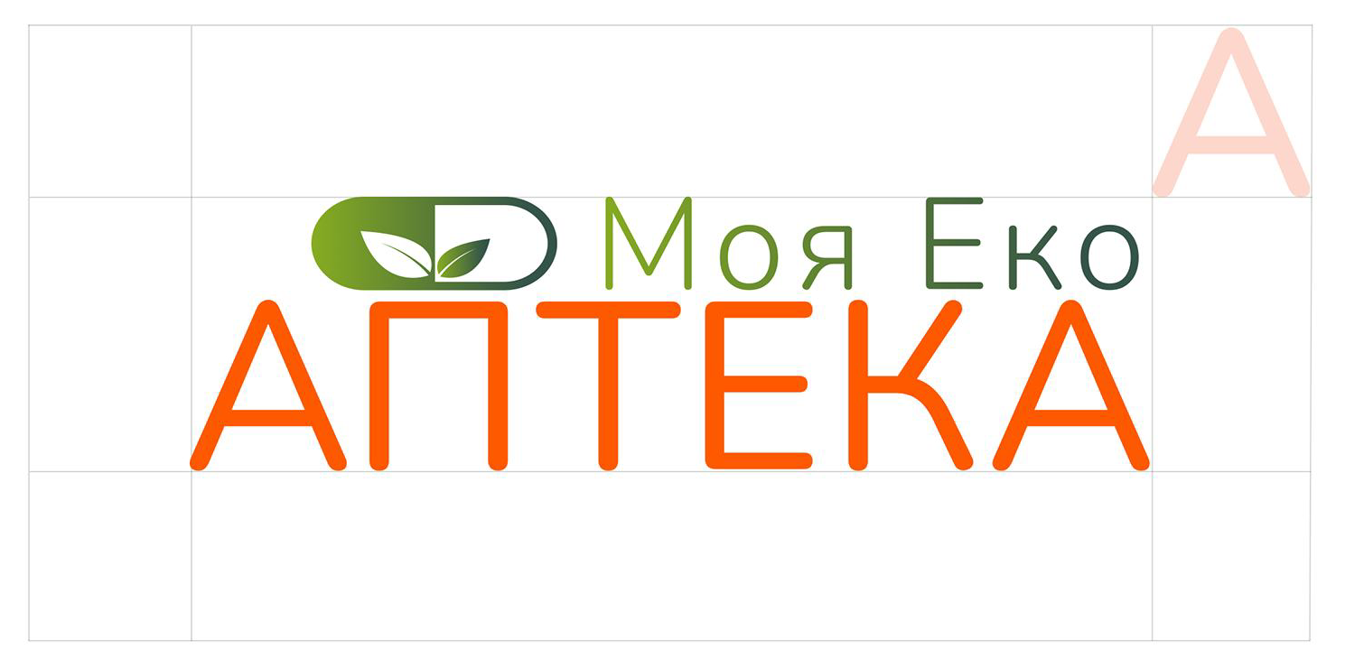
The clear space equals the height of the letter “А” — one grid unit free on every side.
Never reproduce the full logo below 20 mm in print or 120 px on screen.
One ink, two sides.
When colour isn’t an option — engraving, a stamp, single-colour print, a fax or an official document — the logo holds as one solid ink. Positive for light surfaces, knocked out for dark ones, with the leaves always reading as the negative space inside the capsule.
Use a single brand ink or pure black; never mix tones or introduce a second colour in the one-colour lockup.
Full colour on light, reversed on brand surfaces.
Full colour on chalk and light surfaces; a single-colour cream version on green, orange and ink. Always keep strong contrast — never place the mark on a busy, low-contrast photo.
Six ways to break the logo.
Examples of incorrect use — changing the proportions or colours, adding shadows, effects or distortions, or any other element that breaks the identity. When in doubt, place the master files exactly as they are.