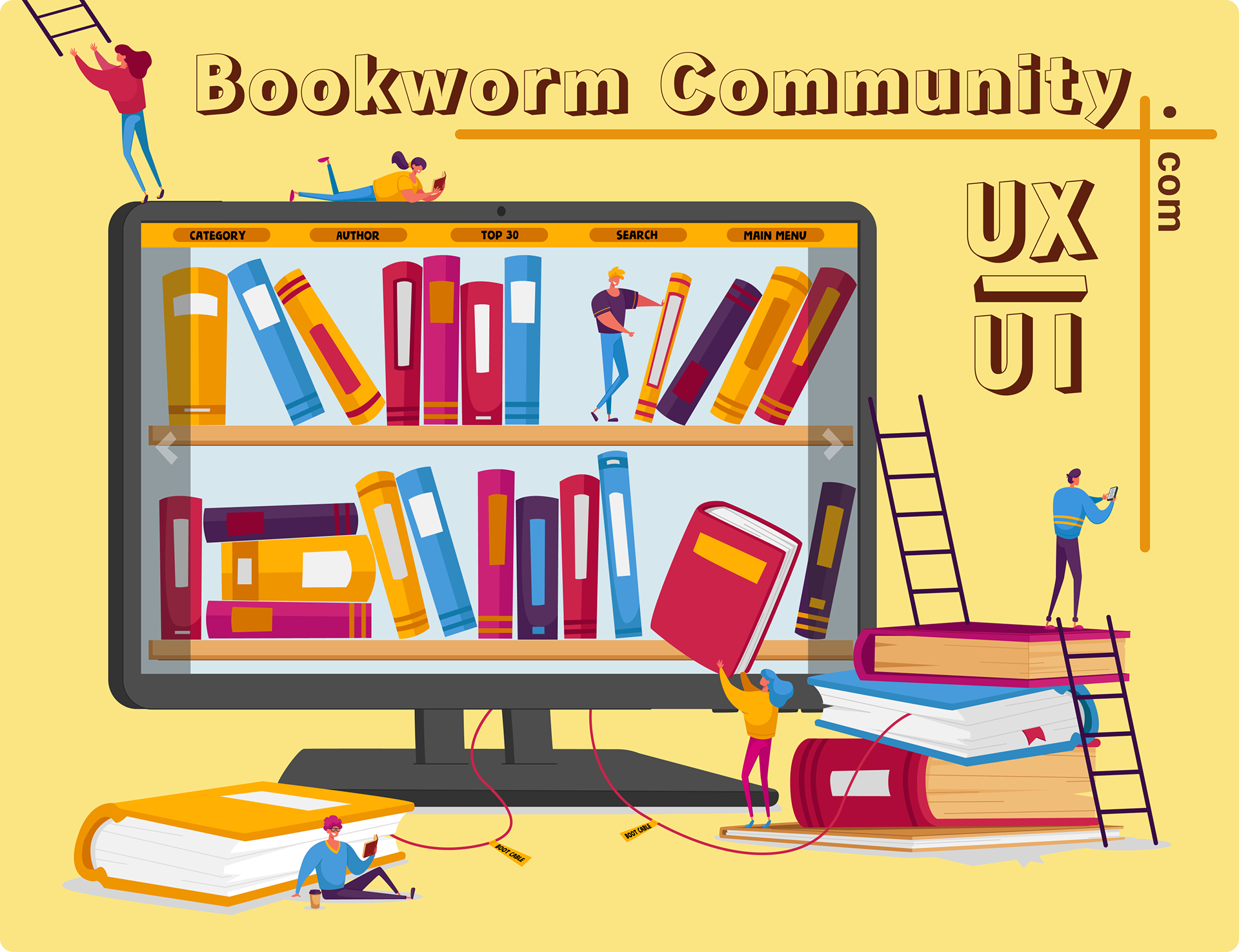
Bookworm
Community
A safe, playful book community for kids aged 7–12 — where young readers discover books, recommend and discuss the ones they love, and build their own shelf, with parents close by.
A joyful place where kids fall in love with reading.
Bookworm Community is a book-discovery community built for children aged 7–12. It’s where kids recommend, rate and discuss books they’ve read — with age-tuned picks, a colourful shelf of their own and a safe space to share reviews with friends, all under gentle parental oversight. (The reading itself happens off-screen — here they find, log and talk about books.)
This case study outlines the UX/UI process behind it — from research with children and parents to a prioritised, safety-first product.
Reading apps aren’t built for young readers.
Most reading platforms are designed for adults — dense catalogues, e-commerce flows and grown-up reviews. Children find them confusing and unsafe, while parents worry about privacy, screen time and who their kids talk to. Young readers need a space that feels like play, keeps them safe, and gently builds the habit of reading.
I researched with both kids and their parents.
A survey of 25 families, plus interviews with children (7–12) and their parents, captured how kids find books today — and what parents need to feel safe letting them explore online.
“She loves stories, but I worry about what she finds online. I need to see what she reads and who she talks to.”
“I want my own bookshelf with cool covers — and a badge every time I finish a book!”
“If it’s safe and helps her learn without nagging, I’m happy to let her explore on her own.”
“I like talking about books with my friends — but only my friends.”
Two people decide: the child and the parent.
A child is the everyday user, but a parent grants access and trust. I designed for both — the explorer and the gatekeeper. Hover a card to bring it forward.
“I want my own shelf with cool covers — and to read more books than my best friend!”
- Find fun books for her age
- Grow a shelf she can show off
- Earn badges for finishing
- Chat about books with friends
- Grown-up apps are confusing
- Too much reading, tiny buttons
- Nothing feels made for her
“I want her to love reading — but I need to know it’s safe and not just more screen time.”
- Age-appropriate, safe content
- Control over friends & chat
- A clear view of what she reads
- Screen-time limits
- Strangers contacting her child
- Inappropriate books or reviews
- Addictive, manipulative design
When… I want… so that…
Four core jobs a young reader hires Bookworm to do — each traced from the trigger, through the motivation, to the result.
Kids want recommendations from peers, not algorithms alone.
Sharing reviews and badges drives them to read and return.
Parents will allow it only if it feels safe and controllable.
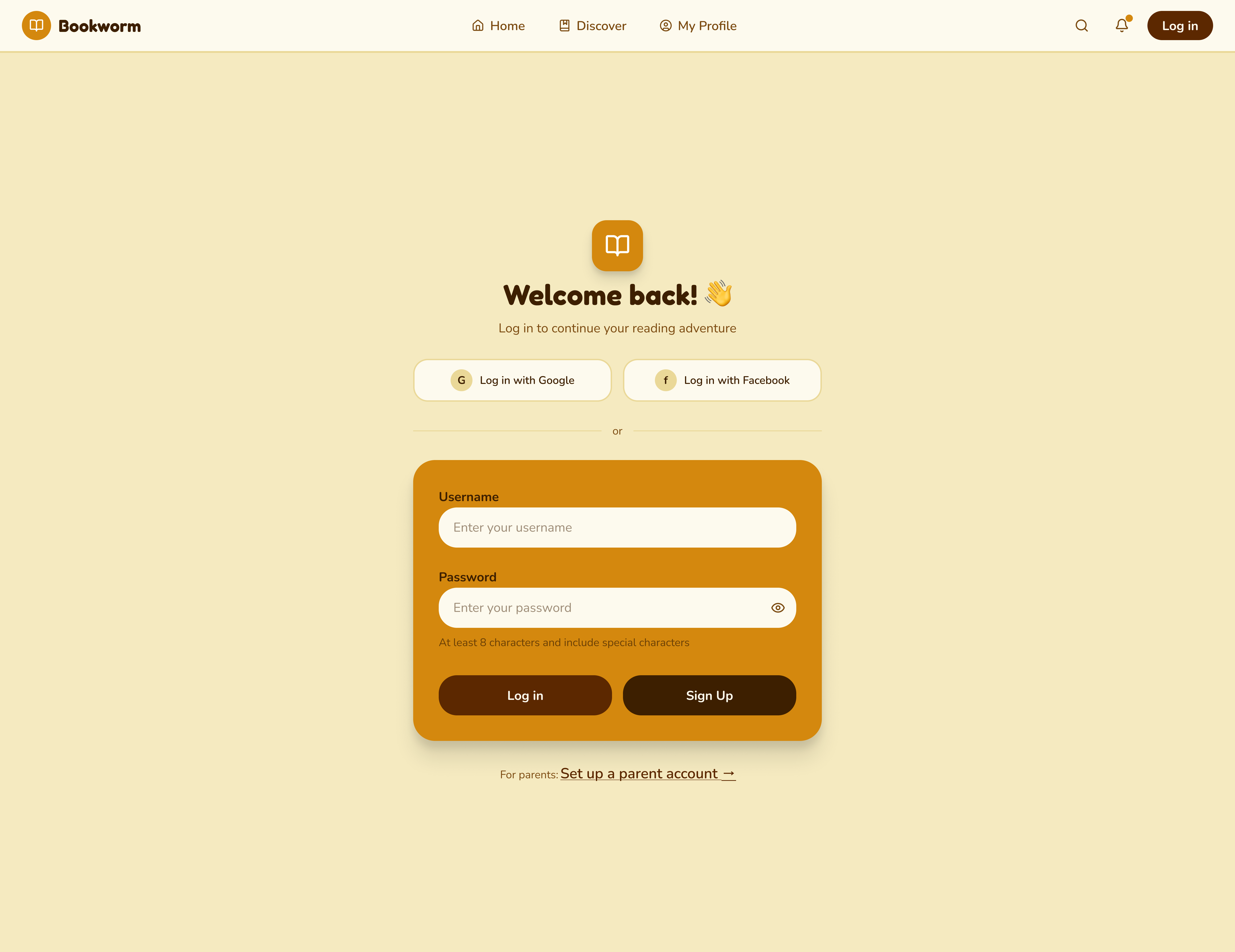
A place parents can trust.
For a children’s product, safety isn’t a feature — it’s the foundation. Every decision was checked against one question: would a parent feel comfortable here?
Parents see what their child reads, sets time limits and approves friends.
No real names, no public profiles — kids connect only with approved friends.
Age-rated books and reviews; reporting is one friendly tap away.
Gentle reading goals and breaks — built to encourage, never to addict.
An Impact–Effort matrix decided what ships first.
Brainstormed features were mapped by value and effort, so the team could focus on the high-value work that defines the product.
- →Video reviews & live streams to discuss books
- →Reading-habit insights for users
- →A/B testing of new features
- ★Recommendation engine that analyses reading taste
- ★Interactive themed discussion forums
- ★Achievements & rewards system
- ★“Read Together” virtual reading rooms
- ·Book-themed quizzes (“Which character are you?”)
- ·Publisher partnerships & virtual events
- ·Branch-style mind-mapped discussions
- ·Reader Exchange for swapping printed books
The full journey — goal, emotion and fix at every stage.
Six stages mapped across seven layers — goals, touchpoints, actions, emotions, barriers, ideas and solutions. Hover a stage to follow it down the map.
Three core journeys, with every decision mapped.
I traced every action and branch — from a child’s first registration (with parental approval) through discovery, community participation and account management — so nothing dead-ends.
Six weeks, understand to test.
A warm system, built for young eyes.
Before any screen, I fixed the building blocks — colour, type and components — so every page feels like the same friendly, safe place.
Cosy and bookish — leather, wood, library shelves. Used for ink and headings; warm, never harsh black.
Playful and inviting — the “call to adventure”. Reserved for primary actions and rewards a child wants to tap.
The page of a storybook — soft on young eyes, calm and non-clinical. Backdrop for almost everything.
Why warm tones for a kids’ reading site? Warm browns and honey evoke storybooks, libraries and being read to — safety and comfort. Cold blues or stark white read as “app” or “school test”; warmth signals play and belonging, encouraging a child to come back.
Testing turned feedback into fixes.
Testing sessions probed navigation, readability and access to core features. Each issue became a targeted change — here are the ones that mattered most.